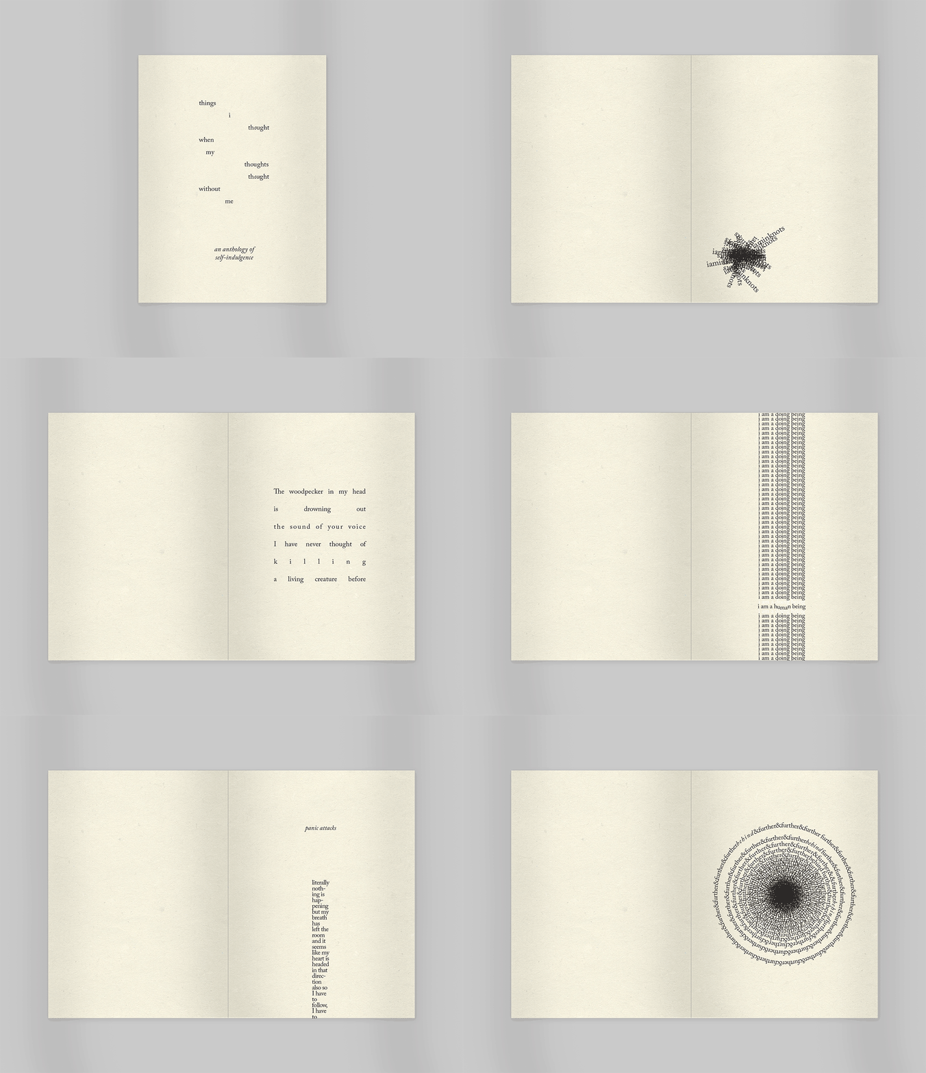
My interest in writing and design has always been driven by a need to understand the intricate relationships between text and image. This has recently manifested itself as an ongoing, in-depth study of visual poetry. Described as “the creation of verbal artefacts which exploit the possibilities, not only of sound, sense and rhythm—the traditional fields of poetry— but also of space,”1 visual poetry is unique in that textual and visual rhetoric interact to create meaning. Ever since I learned of Guillaume Apollinaire’s iconic il Pleut — a poem in which the stanzas are arranged in the form of falling rain, echoing the piece's subject — I have been infatuated with the subject. After all, it is the perfect combination of my two favourite activities: writing and graphic design.

I began this project with my third favourite activity: research. In the process of pouring over countless journal articles, I learned about three types of visual poetry. The first form is the Calligram, in which a poem is designed to create a literal image discussed in the text, as is the case in Apollinaire’s work. Next, I studied figurative poetry, in particular, the work of E. E. Cummings. This form uses space and layout in a more abstract way: “The deviation from the horizontal or vertical line is an expression of reified kinesis. It contains tension and release, movement, change of direction, pausing and other kinetic experiences —all of which are internalized by the reader as his eye moves along the path of the poem's letters.”2 Finally, in concrete poetry, layout and space act as an integral part of the work: if the poems were printed conventionally, they would lose their meaning.
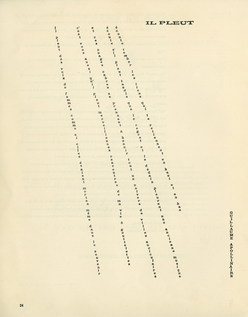
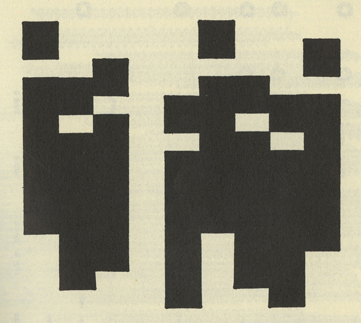
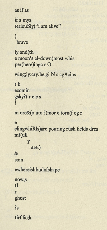
Left: Apollinaire, Guillaume. il Pleut. 1918. In Apollinaire’s Lyrical Ideograms. London: Gaberbocchus, 1968.
Centre: Wildman, Eugene. Untitled. In Anthology of Concretism. Chicago: Swallow Press, 1969.
Right: Cummings, E. E. Untitled. In Selected Poems. New York: Liveright, 1994.
The most interesting part of my research on visual poetry was the intricacy with which meaning is created: visual poetry involves a “network of action, reaction and interaction at the imagistic level [that] is far more complex than normal poetry. Relationships exist (1) between visual and non-visual images (visual-textual) ; (2) between visual images (visual-visual) ; and (3) between non-visual images (textual-textual).”3 Through my research, I hope to gain a better understanding of how these devices function and interact with one another.
My initial research also revealed that historically, visual poetry has almost entirely been explored in the context of two-dimensional, static printed pieces. However, little to no attention has been paid to how elements such as time, motion, sound, tactility and interactivity might serve as new types of rhetorical devices. For me, this indicated an area rich with opportunity for exploration.
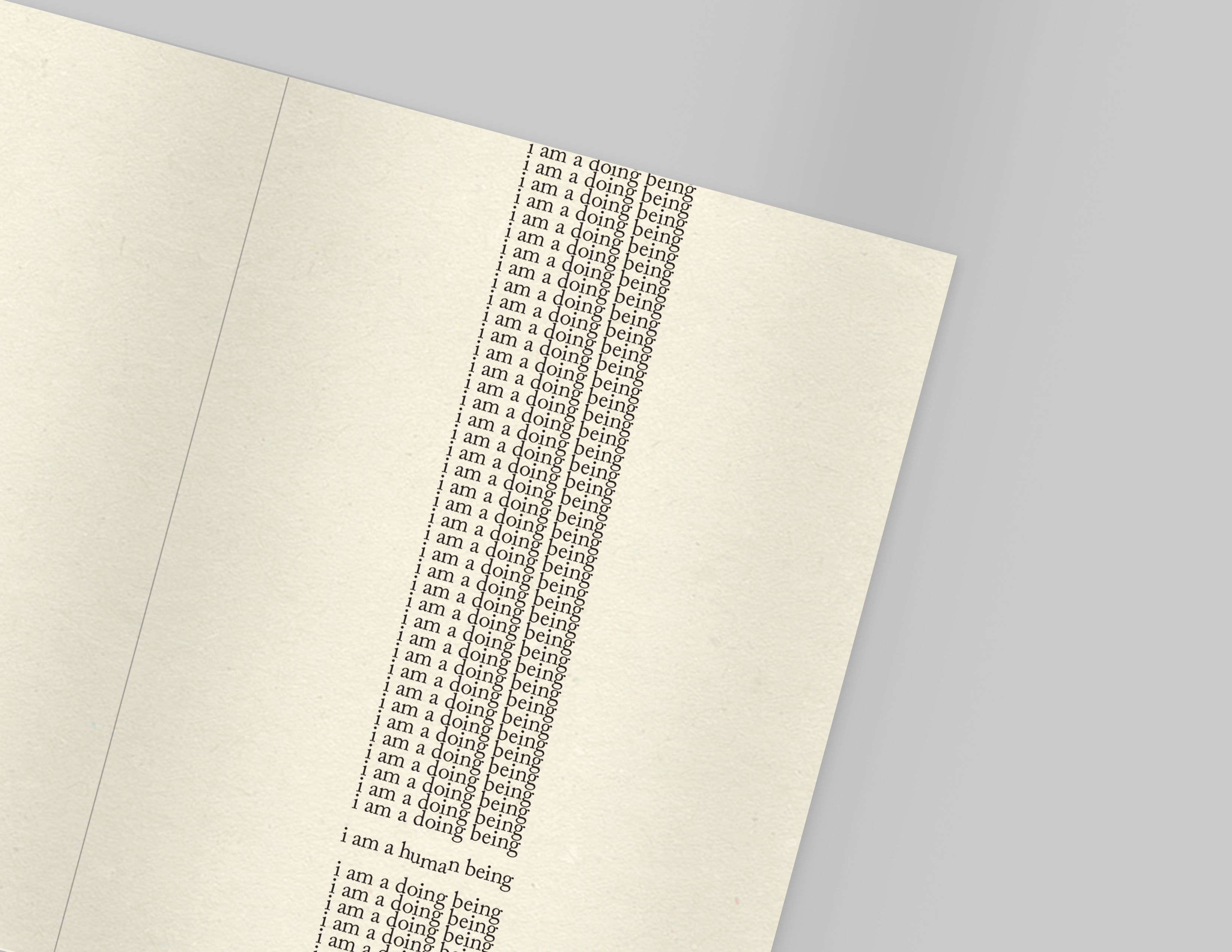
In an attempt to explore new types of visual rhetoric, I conducted a series of written and graphic experiments. I began by creating a short printed pocket anthology using self-authored poetry. I hoped that designing and authoring a series of visual poems myself would give me a better understanding of how tools like repetition, visual density and more can be used a visual rhetorical devices.
This research happened to coincide with a turbulent time in my personal life. Struggling with worsening Anxiety and Depression, I began to write about my experiences, using them as the inspiration for my anthology. While I hoped to connect with other suffering individuals, writing also served as a way to sort through and make sense of my own experiences.
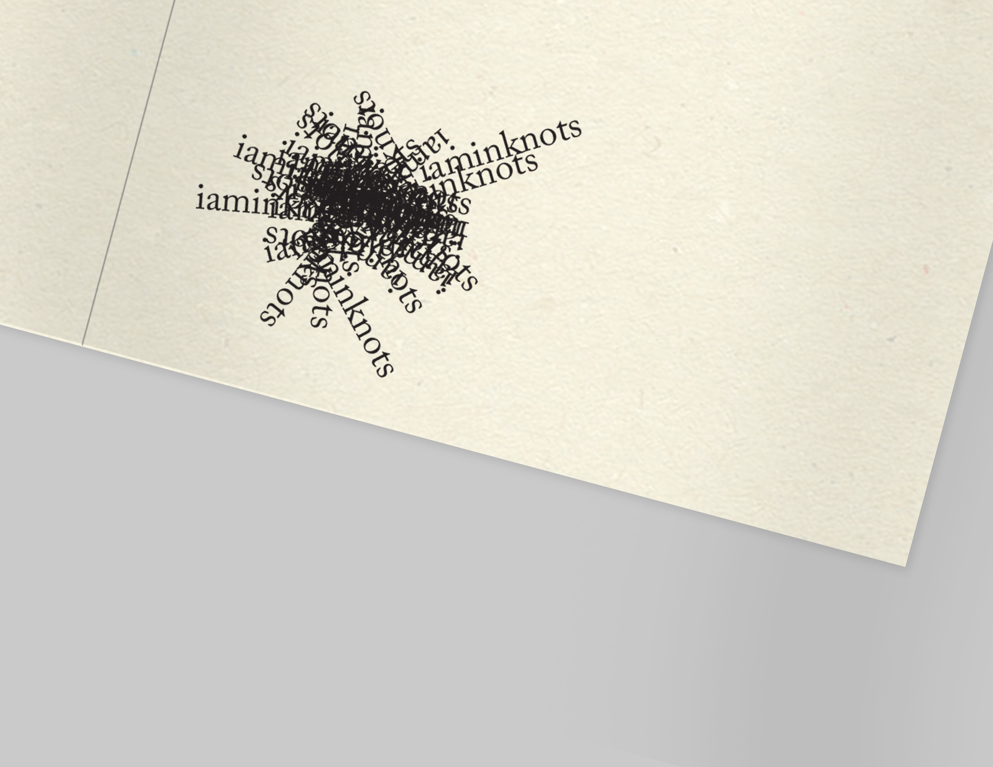
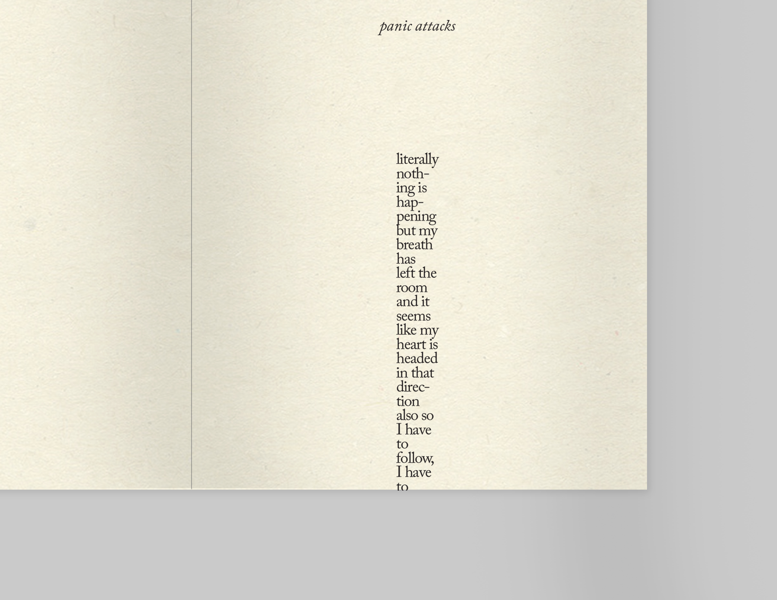
My creative process was decidedly dialectical in nature: I would write, then design a visual poem, then edit the text to eliminate redundancies, then tweak the layout, then edit the text again. Layouts were largely based on any sort of emotive qualities or images that I could discern from the poems. In order to focus my research on how static, two-dimensional manipulations could be used to add meaning to visual poetry, I set a number of rules for myself: I would only use ten point black Caslon in either Regular or Italic, and would limit myself to simple typographic manipulations like leading and tracking.
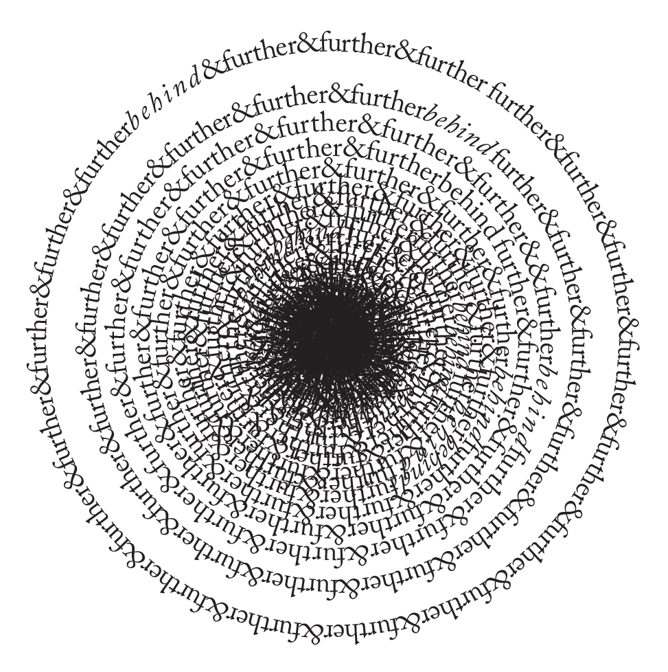
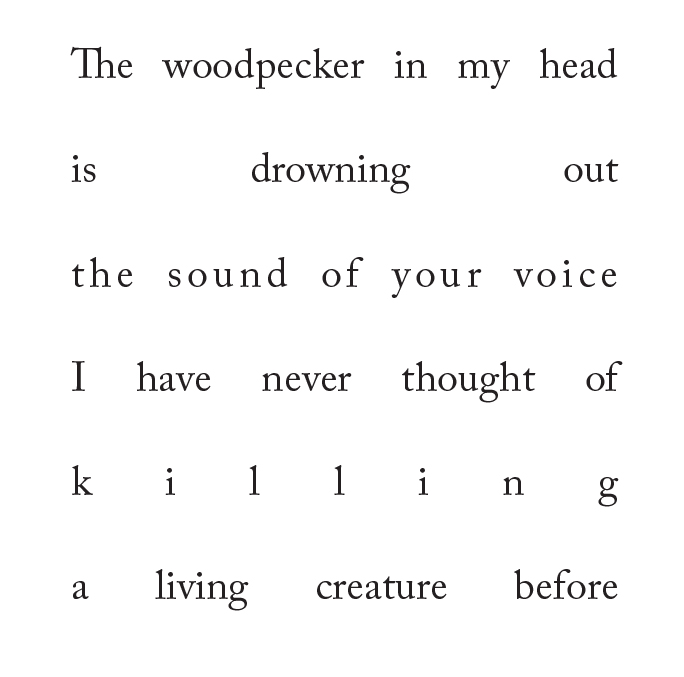
Next, I translated my ten poems from my initial anthology into a series of motion shorts with sound (a sort of “motion anthology”). While attempting to make static poems dynamic, I found that many of the same principles were true in motion as in print: rhythm and tone could still be created through repetition, tracking, leading, visual density, spacing and other simple typographic manipulations. However, the ability to "chunk" sequences of information, affect speed, change/revert elements, and move elements across the composition added further opportunities for exploration. Sound was also an interesting avenue, as I experimented with more explicit and more abstract sounds. While in some cases they were used purely to establish a mood, in others they helped establish steps in the narrative sequence that are not stated in the poem itself.
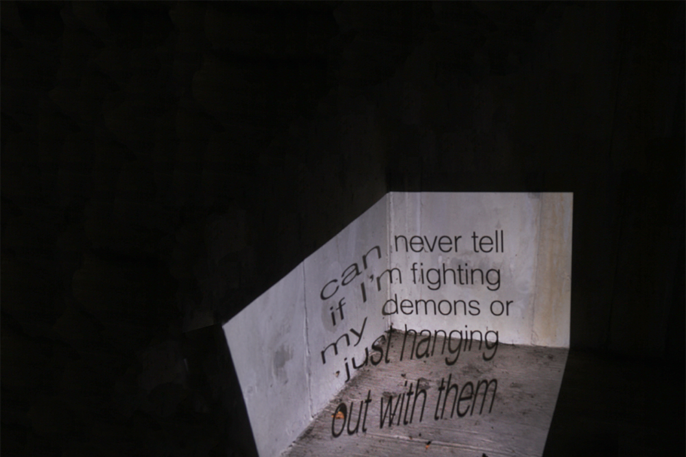
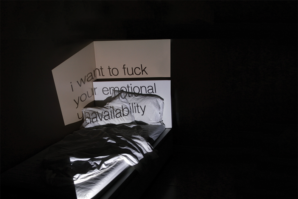
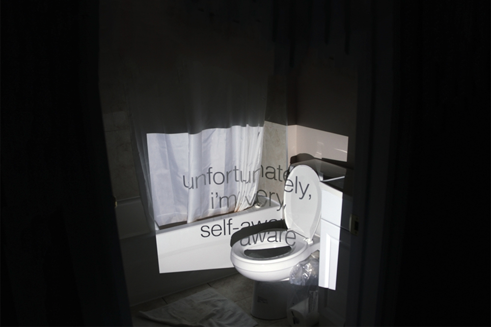
My next experimentations focused on how environment might be used as a rhetorical device in visual poetry. Drawing on an essay by Kenneth Goldsmith, where he described contemporary visual poetry as “influenced…but the compressed language of twitter,”4 I decided to source the content for these from poet Melissa Broder’s twitter account, @sosadtoday, as she primarily talks about issues surrounding mental health. I selected a few tweets from Broder’s page, projected them into various spaces, and then photographed the results. These investigations proved formally fruitful: the distortion of the projected type as it contoured to the surface it was projected on interfered with legibility in interesting ways, and introduced visual tension.
After exploring visual poetry through digital –and primarily typographic– means, I decided to revert to a more analog approach, creating a short series of collage experiments. The process was quick and intuitive, and involved using abstract imagery as a sort of visual “diction.” While the results are somewhat successful, these poems were quite explicit in nature. After analyzing the role of textual and visual rhetoric in these pieces thoroughly, I decided that future visual poems should do less “spoon-feeding,” leaving more room open for the viewer’s own experiences and interpretations.
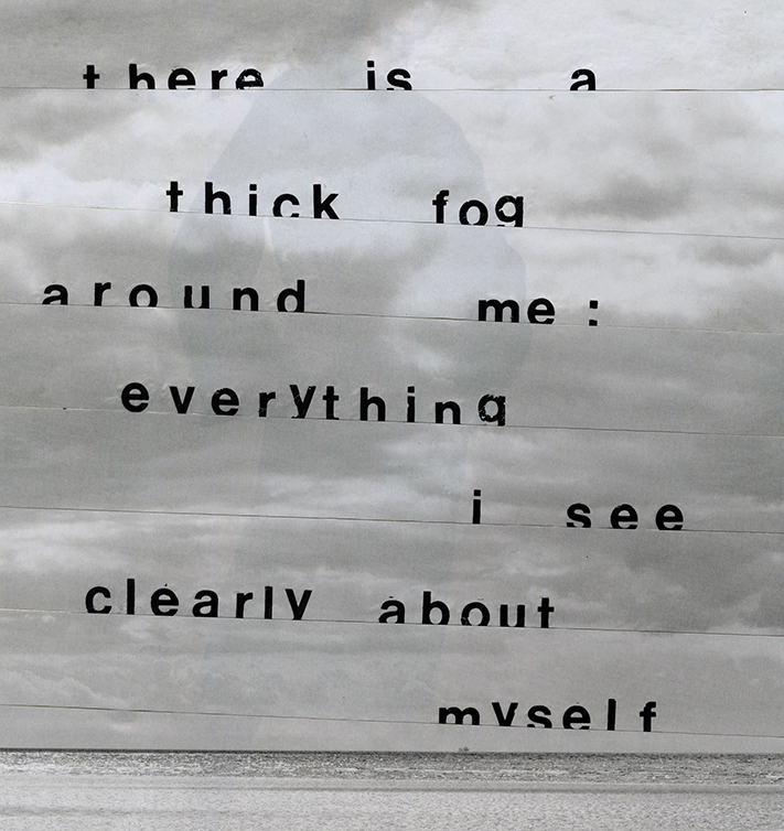
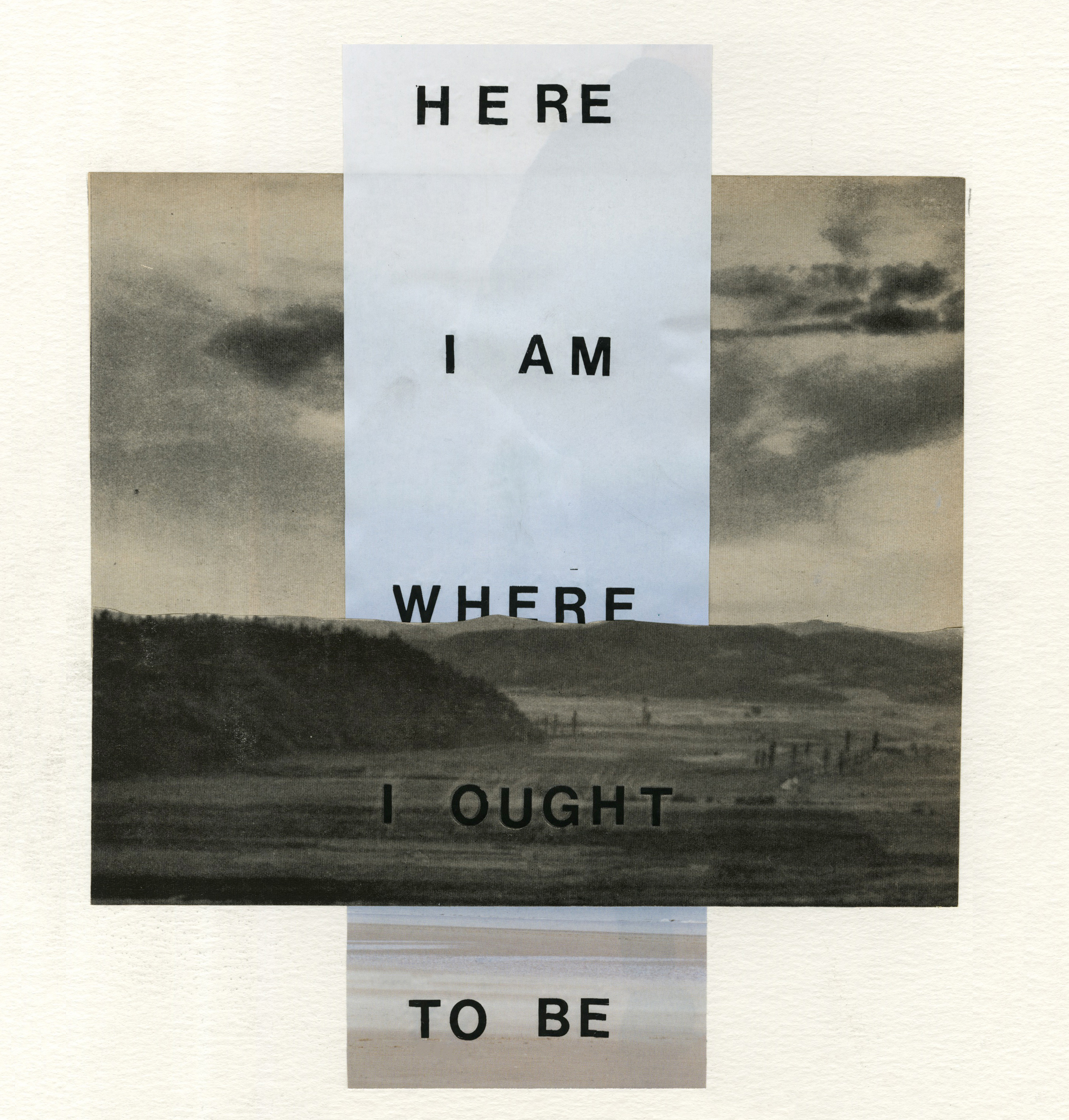
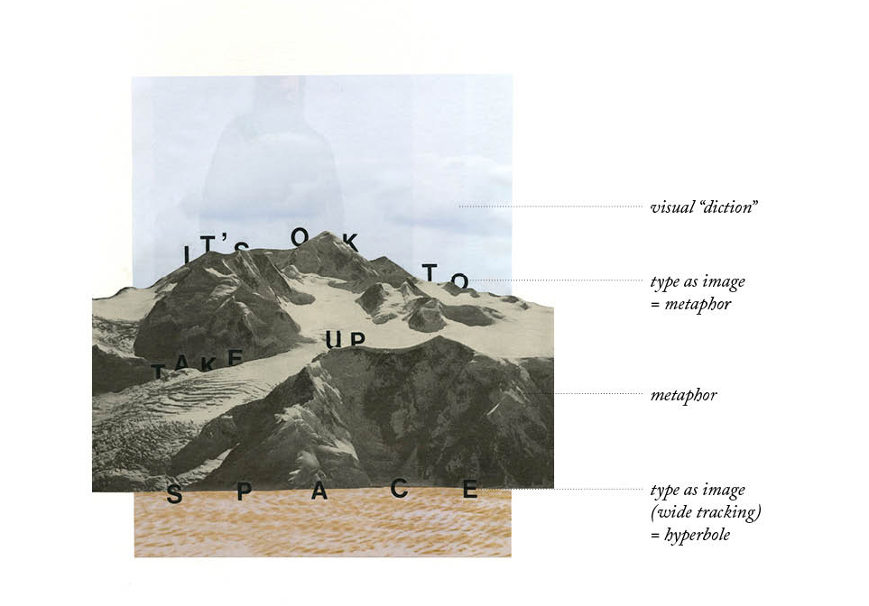
Next, I turned my attention towards the potentialities of the web, exploring how layering, scrolling, interactions, and hover states could be used as visual rhetorical devices. I created a series of rough “web collages,” hoping to test out these capabilities. I found that the web allowed for information to be sequenced in unique ways, as some text and images can remain on screen at all times, while others disappear as the user scrolls. This allows images and text to interact in new and complicated ways as the user moves through the poems– a novel experience that has exciting implications for poetry and storytelling.
View the culmination of this project, thingsithought.today, here.
1. R. P. Draper, "Concrete Poetry," New Literary History 2, no. 2 (1971): 329, accessed September 25, 2016, doi:10.2307/468606.
2. Martin Heusser, "The Visual Rhetoric of E. E. Cummings's ‘poempictures’," Word & Image 11, no. 1 (1995): 17, accessed September 28, 2016, doi:10.1080/02666286.1995.10435894.
3. Willard Bohn, "Metaphor and Metonymy in Apollinaire's Calligrams," Willard Romanic Review 2, no. 72 (March 1, 1981): 181, accessed September 27, 2016, ProQuest.
4. Victoria Bean et al., The New Concrete: Visual Poetry in the 21st Century (London, UK: Hayward Publishing), 12.