A “dynamic public space” and a “hotspot for recreation, arts and cultural activity” since its opening in 2012, the Queen Elizabeth Park Community and Cultural Centre (QEPCCC) has become a key player in fostering the arts and cultural scene of the city of Oakville. What’s more, the centre is an accessible space for people of all ages and abilities to maintain their physical fitness. At 144,000 square feet, it is the largest space of its kind in Canada.

At present, the QEPCCC promotes its events primarily by using letter-sized flyers posted on bulletin boards throughout the centre. Internal user groups and external community members also use the bulletin boards as promotional spaces. Furthermore, the QEPCCC is an important hub for the Town of Oakville to share information with its residents through postings and pamphlets. The wide range of stakeholders using the bulletin boards has resulted in a visual milieu without hierarchy: the QEPCCC’s efforts to promote their own events get lost in a sea of homemade flyers. What’s more, as a government subsidized space, the QEPCCC has few resources to dedicate to promotions and graphic design.


I set out to develop a system that would allow the QEPCCC to remain a central organizing space for its key stakeholders, while also creating a promotional hierarchy that prioritizes QEPCCC staff promotions. However, I was determined to avoid creating a system that would add work to QEPCCC staff members– or that would result in the greater allocation of funds towards promotions and graphic design. Additionally, in accordance with the QEPCCC’s commitment to sustainability, I saw an opportunity to alleviate the environmental burden of creating hundreds of paper flyers to promote various events.
Before jumping into the design process, I conducted an audit of all the promotions at the QEPCCC. During a site visit, I photographed all of the bulletin boards in the space. Later, I reviewed the photos, and noted where each flyer was posted, by whom, for what purpose, and what type of posting it was (e.g. flyer, standing banner, etc.)
I found that 48% of all postings were posted by QEPCCC staff, 28.4% were posted on behalf of the Town of Oakville, 12.7% were posted by internal QEPCCC user groups, and 10.9% were posted by Oakville community members or organizations that do not operate out of the centre. Additionally, I learned that 64.7% of all posts were promoting events or other programming, while about 35.3% were informational postings (e.g. fun facts, exercise regimens, etc.).
The signage audit made it clear that the design solution must allow for a high degree of flexibility and must have the egalitarian and democratic characteristics of the current bulletin board system. The investigation also made it clear that promotional hierarchy is lacking, and that there should be a way to prioritize QEPCCC events so that they are not lost amongst the other promotions.

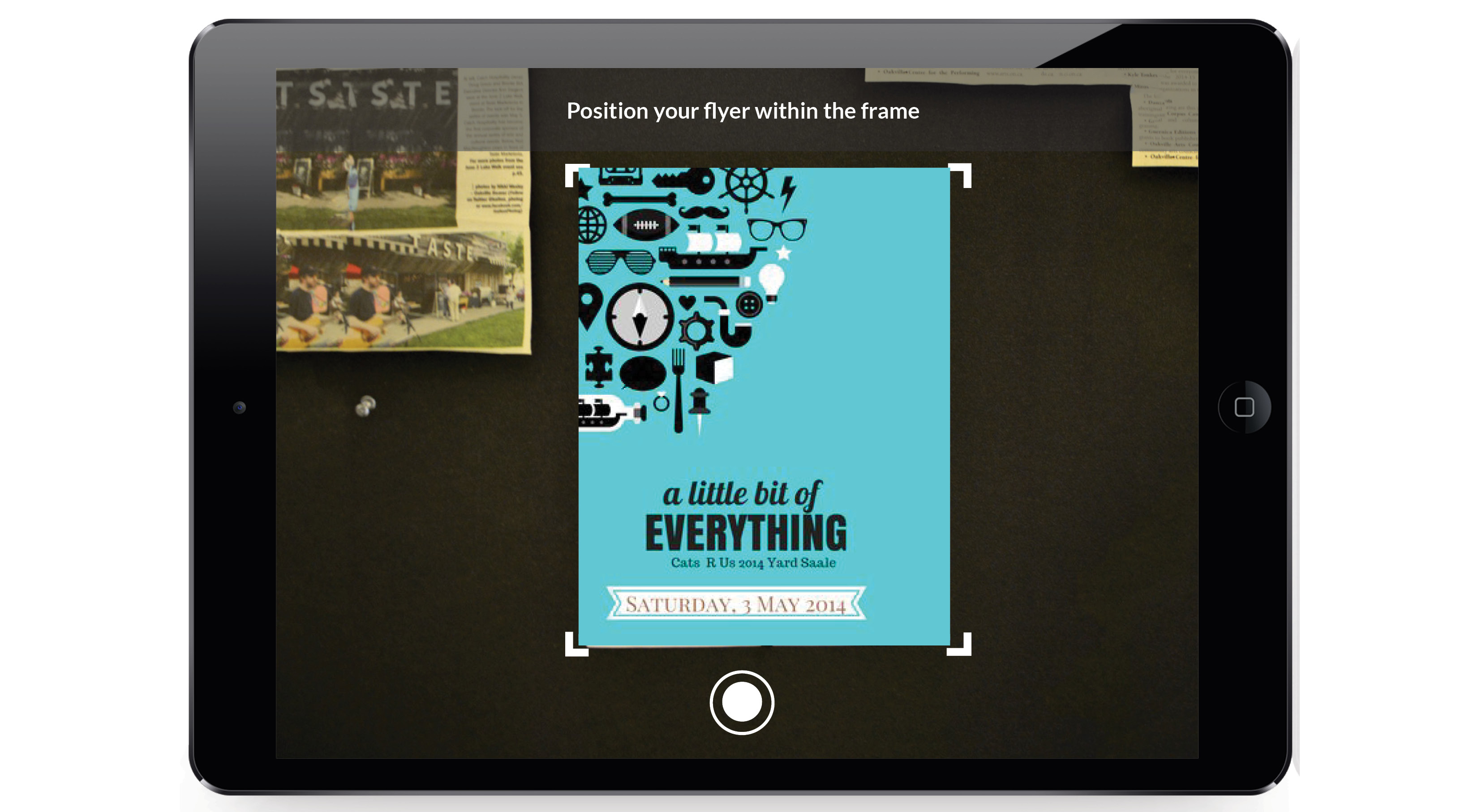
While conceptualizing, I realized that while the existing bulletin board system was lacking in visual hierarchy, it was inherently democratic in that it allowed all stakeholders to organize their events by simply posting a flyer. I decided that my solution should mimic the analog process of posting a flyer through digital processes: I would create a digital bulletin board system whereby users could scan a flyer using an iPad camera, then distribute flyers instantly around the QEPCCC through digital processes. The system would also allow users to add event details, making the flyers searchable. QEPCCC visitors could then interact with touch digital bulletin boards throughout the centre to search and browse flyers.

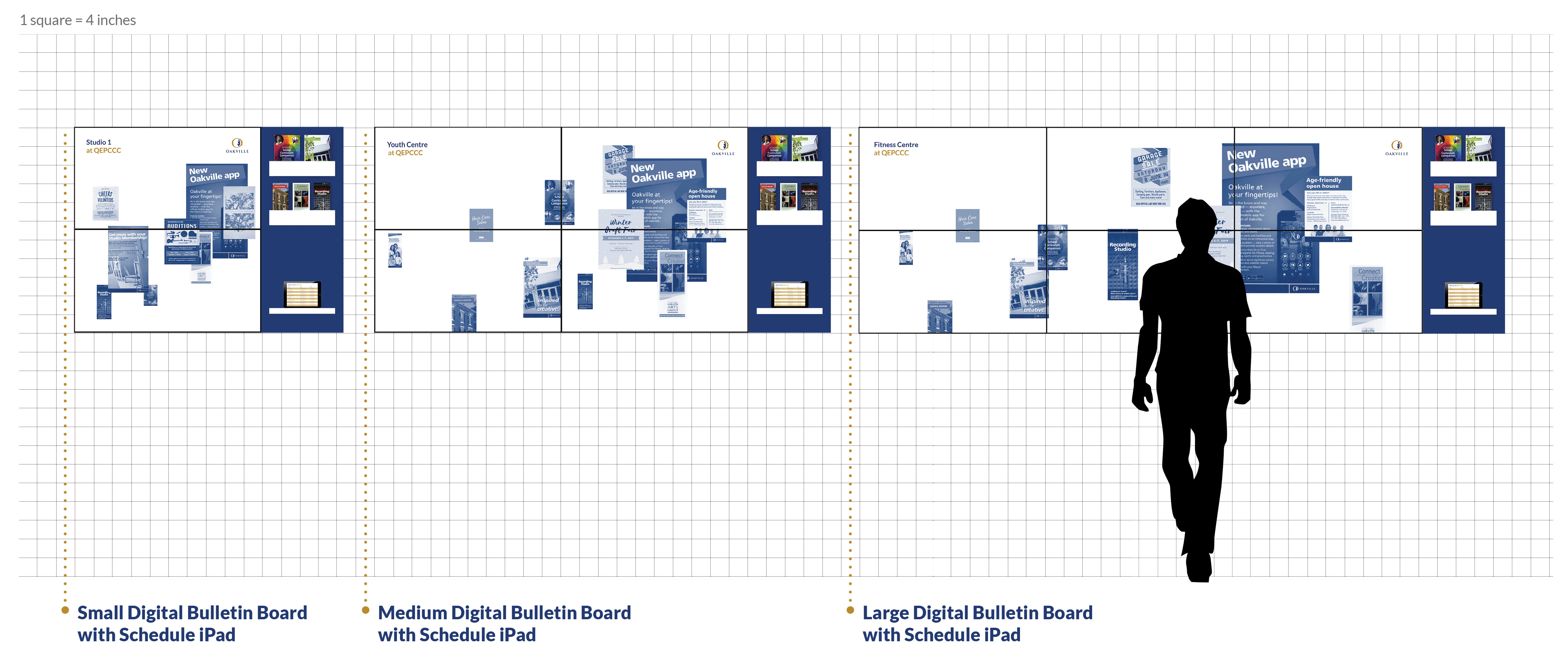
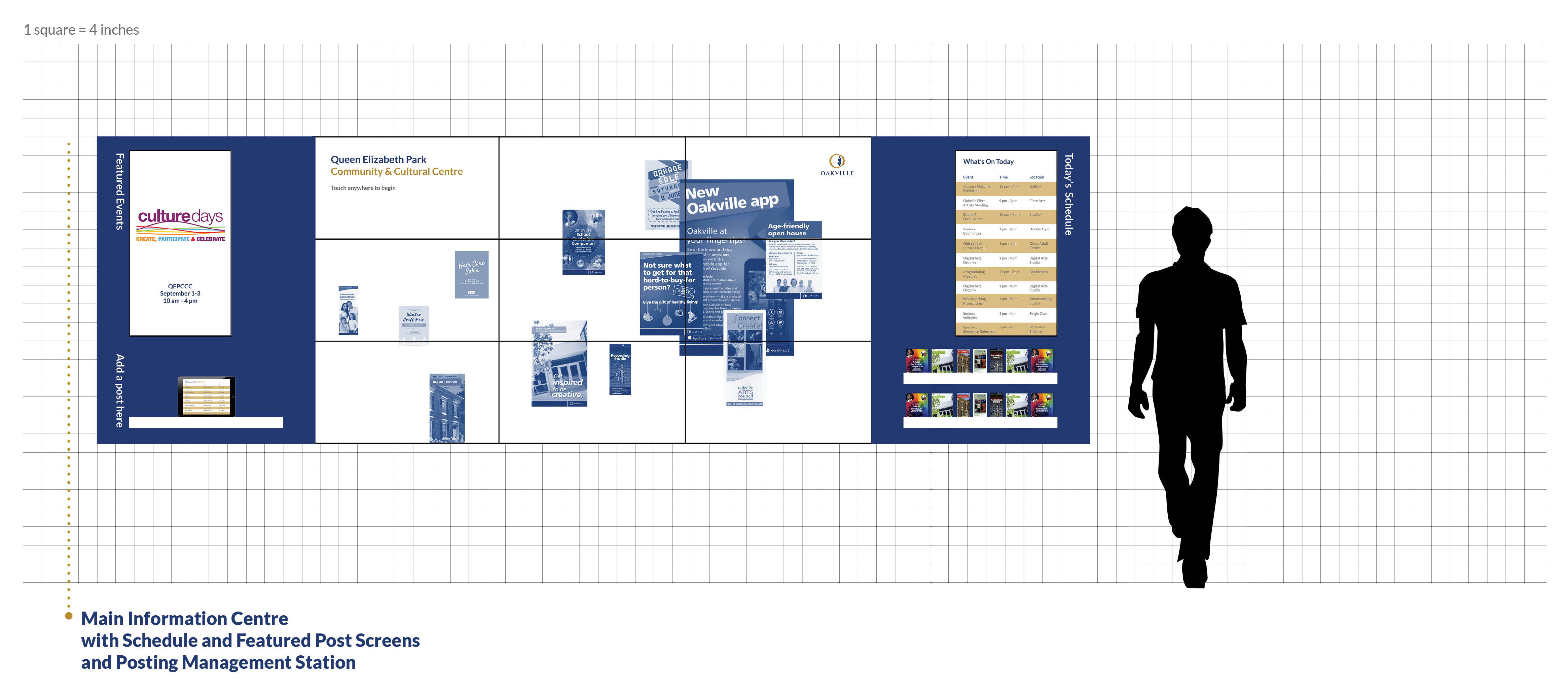
The digital bulletin board system at the QEPCCC would be modular in nature, allowing for different sized “bulletin boards” to be used throughout the centre. The photo below shows the family of elements, consisting of a small, medium, and large versions of the bulletin boards. It also includes an “Information Centre,” which will be the largest scale bulletin board located in the lobby of the QEPCCC. The Information Centre would be equipped with a “Posting Management Station”: essentially, an iPad that allows visitors and staff to scan and upload a flyer using the camera, add details, and distribute it digitally on the centre’s various “bulletin boards.”


Inspired by the QEPCCC’s creative mandate, I designed the interface of the digital bulletin boards to mimic artistic collages. The collages are made out of uploaded flyers, and an algorithm in the system would make postings added by QEPCCC staff more prominent in the collage to create a sense of visual hierarchy. Additionally, the Information Centre would be equipped with additional screens whose sole purpose is to show a slideshow of QEPCCC events, once again improving the hierarchy of promotions. Finally, QEPCCC staff would have the option to override all of the digital bulletin boards in the centre during special events with their event branding, effectively creating a strong visual identity and sense of place instantly, and at no cost.
One challenge I encountered while designing the interface was the problem of busyness: the flyers were all so visually distinct in terms of colour and design that the interface looked overwhelming. To create a sense of unity, I created monotone versions of the flyer using the navy blue from the Town of Oakville logo. When users tap a flyer to view it in more detail, they can see the full colour version. This approach helped create a cleaner and more cohesive feel.


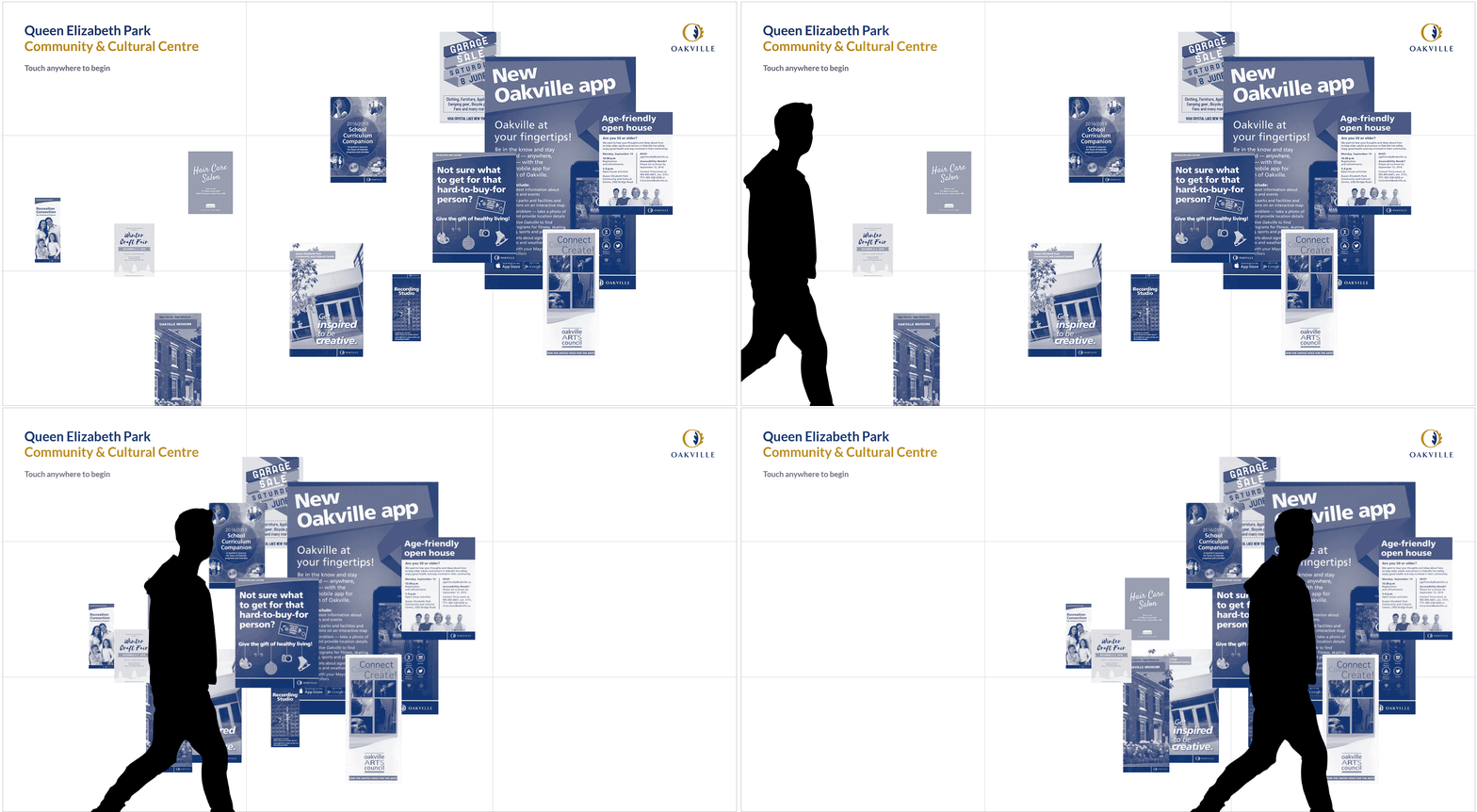
All of the Digital Bulletin Boards would also be equipped with a Kinect motion sensor, so that the onscreen flyers would cluster and track the movement of passersby. This novel interaction would serve to intrigue children and adults alike, drawing them in to investigate the bulletin boards closer.

Elise is the Director of Special Programming at the QEPCCC. She is responsible for organizing events such as the annual World of Threads Festival, as well as Culture Days. Elise’s biggest challenge when organizing these events is the lack of funds available for promotions. She does what she can to get a good turnout.

Elise approaches the lobby’s Information Centre, and picks up the Promotions Management iPad. She logs in with her Staff ID and taps “Add a post”. She photographs the poster for Culture Days.

She adds a brief description of the event, as well as the date, time and location. Next, the system asks Elise to select the digital bulletin boards around the building that she would like to have her post on. Elise selects them all, since this is a general interest event for community members of all ages.

As a staff member, Elise has the option to prioritize her postings over other community member’s posts. This means that the post will be featured in a slideshow of posts on the screen directly adjacent to the main set of screens in the Information Centre. It also means that her post will appear at the front of the “collage” of posts on the Digital Bulletin Boards throughout the QEPCCC.

On the first day of Culture Days, Elise uses the Promotions Management iPad to override all of the digital bulletin boards in the QEPCCC with her promotional image. In just a few minutes, without spending any money or wasting any paper, Elise has transformed the space to mark the event.
Tom is a high school student who is a frequent attendee of the QEPCCC’s Youth Centre programming. Today, he is at the QEPCCC to post a flyer advertising a rummage sale at his school that is raising money for CAMH in Toronto.

Tom approaches the Information Centre and uses the Promotions Management iPad to scan his flyer. He only printed one copy, because he knows the QEPCCC uses digital bulletin boards. Tom was happy to save money and paper. He crops the scan to his liking.

Tom is presented with a list of bulletin boards around the QEPCCC. He decides that the Older Adult Centre as well as the General Information boards are appropriate choices, but he decides to omit the Youth Centre board. He submits the posting.

Tom is hungry from his bike ride to the QEPCCC so he decides to buy a muffin from the café and eat it in the lobby. A few minutes after he sits down, Tom notices an older woman approach the Information Centre and tap his flyer. He watches with interest.

The visitor examines the flyer closely and reads the accompanying descriptive text. They tap the “save” button on the screen, input their email address, and send the flyer to themselves to look at later. Tom is thrilled that the visitor is interested in the rummage sale. He thinks they will raise a lot of money.